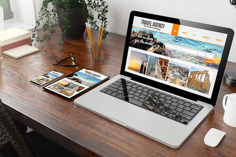

Congratulations, you’ve successfully launched your eCommerce website! Now is the time to relax and see…
On a Monday morning, you stumble inside an elevator with a much-needed mug of coffee in one hand and bag in the other. You mumble a grumbled greeting to your fellow riders in the lift.
Looking up, you come into senses that your fellow rider is none other than your idol. Do you introduce yourself to the person? Would you tell them how much you admire their craft? Would you request for an autograph?
Ding. Too late. The time to act has gone. Your eight-second ride is over, your idol exits the lift, leaving you in the dust. This futile attempt at making an impression outlines our eCommerce world today.
We breathe in a world where you get a time window of a few seconds for the first (and probably only) encounter of your brand with a consumer. HubSpot even suggests websites to inform the visitors what all they can offer within 3 seconds.
Quickly drawing and maintaining the attention of the customer means utilizing an above the fold design strategy for your website. That’s the reason we’re sharing the highly appreciated eCommerce website designs.
eCommerce Website Designs That Drive Conversion
As customers, we are overwhelmed with thousands of branded pieces of content every day. It is almost impossible to view, digest, and act upon each one of these, and only a small portion of them leaves an impact on us.
Let’s peek at one category of branded content, particularly the website. A brand’s website works as both an intro to the brand and a route to buy its products. The majority of initial impressions come from the website design of a brand.
Now we will understand how these eCommerce website designs employ several strategies to drive conversion.
Ahrefs
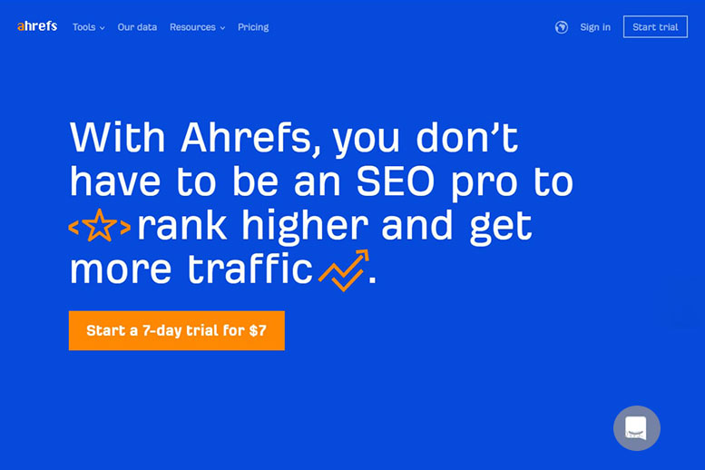
Ahrefs makes excellent use of white space (in their case, blue) on their homepage. It’s hard to find a balance between white space and content. However, the website design of Ahrefs’ provides a copy of proper sizing and spacing, resulting in better opportunities for conversion.
The folks at Ahrefs chose to display one bold CTA in orange color, making it pop out of the background to avoid inundating the user with a plethora of options. The contrast orange and blue quickly leads the user to the next step, beginning a complimentary trial.
Pure Cycles
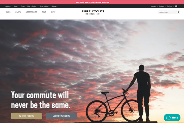
The logo, navigation utility links, search box, navigation menu, and the main image of the website are the most crucial elements of any eCommerce website. Pure Cycles incorporates all these elements above the fold.
Additionally, to make sure the user is not overwhelmed with the essential elements, Pure Cycles uses contrasting colors and types to create some hierarchy among the elements of the website.
The navigation menu is in black containing information for shoppers looking to know more, whereas the navigation menu in white leads the visitors to products they can buy.
Finally, adding some intrigue with stunning lifestyle photography is cherry on the cake for this website.
Airbnb
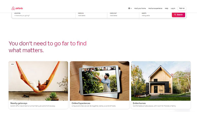
It’s essential to be a step ahead of customers. Airbnb is one shining example of this. The header of the home page incorporates a dynamic search bar allowing customers to hunt a place to stay once they enter the home page.
It’s not only convenient, but it also assures a faster path to purchase. The absence of this search bar, particularly on the home page, may result in a drop off of some users.
Also, we appreciate how the company answers to the current situation, the country is going through, with a bold and clear statement on the home page.
North Face
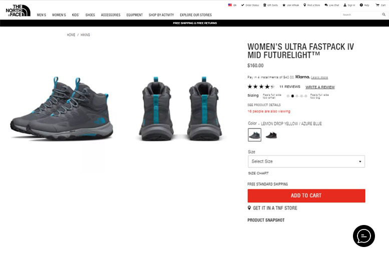
While formulating a path to purchase, it is crucial to direct the user through the process. Highlighting a CTA is one way to achieve that, and North Face is highly successful at that.
The user is directed easily through the site with the help of contrasting colors and typography. Additionally, the red and large CTA button, ensures there are zero drop-offs in the decisive phase of purchase.
The ‘Chat’ button is a bonus, making sure that the customer can have any questions/concerns answered from the convenience of the same webpage.
Wrap-up
We hope that our blog about eCommerce site designs will inspire the design of your web pages. Make the online encounter of the customers with your brand unforgettable and create an intuitive buying experience. The only chance for you is to make a remarkable first impression!
And in case you are looking for help with your eCommerce website design, reach us through the comment section below. Our team will be happy to be in touch with you!


Leave a Reply